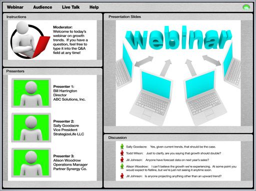
One of the challenges with any project is getting everyone on the same page. Over the years I have found that the best tool to help solve this problem is a clickable demo. The demo is so useful it is one of the first steps in a new project. Creating the clickable demo can be simple and straightforward or a big effort in itself. However, these actions make even a complex system easy to model.
Go With the Flow
An important part of a clickable demo is an example of the application flow. When use cases are properly done, they should be a stepping stone to the application flow. The use cases will not provide all of the details, but a good demo will address every user story. The look and feel of the demo are not as important initially as the flow. It should model how a user will progress through the application while providing a rough approximation of the data they will be presented. General navigation should be worked in early on as well.
Look For Important Details
Some requirements are more important than others. The requirements that a good clickable demo presents include those around data input and output or reporting. When a customer is reviewing a clickable demo, they should be able to tie steps into current use cases. This link is best accomplished by showing details around each step.
For example, let’s consider an application that includes data entry and search for entered records. A good clickable demo will show the input fields as close as possible to the end product. This should be at least eighty percent of the requirements for data entry. The search, in this case, should allow a search on enough of the data entry fields to be easy to find any given record. A customer should be given an example of how difficult or easy the interface will be for regular usage.
Leave Room For Discussion
The purpose of this demo-based approach is to provide a focus point for customers. Don’t be afraid to leave a few areas open for interpretation. Also, avoid getting designed into a corner. The demo is not production code so spending a lot of time on it may be a wasted effort. As iterations of the demo are presented there will be areas that become concrete, but early on avoid lock-in where possible.
The Danger of a Clickable Demo
I started with a claim of this approach being perfect for any project. That does not mean it is not without risks. The most common issue with a demo of this type is that it is “too good.” In this situation, a customer falls in love with the demo. The result is not a criticism, but instead something along the lines of “when can we ship it?” This tricky situation can be avoided by clearly stating smoke and mirrors and lacking functionality during the walk through. Set the expectations early, and clearly, so there is not an underestimation of the effort required to make the demo fully functional.
The problem with a vision is that it is not reality. Thus, everyone is left to their interpretation of the goals. Try a clickable demo next time to bring a vision into reality early in a project life-cycle. It will make discussions of the vision much easier and will help avoid misunderstanding of conceptual features.

Leave a Reply
You must be logged in to post a comment.